In 'The Bold Idea,' Michael Twyman argues that the rise of bold type was not a matter of stylistic preference but a response to broader shifts in society; the expansion of education, the growing volume of printed matter, competitive pressures in advertising, and a new, non-linear way of thinking about text exemplified by graphs, charts, and tables.
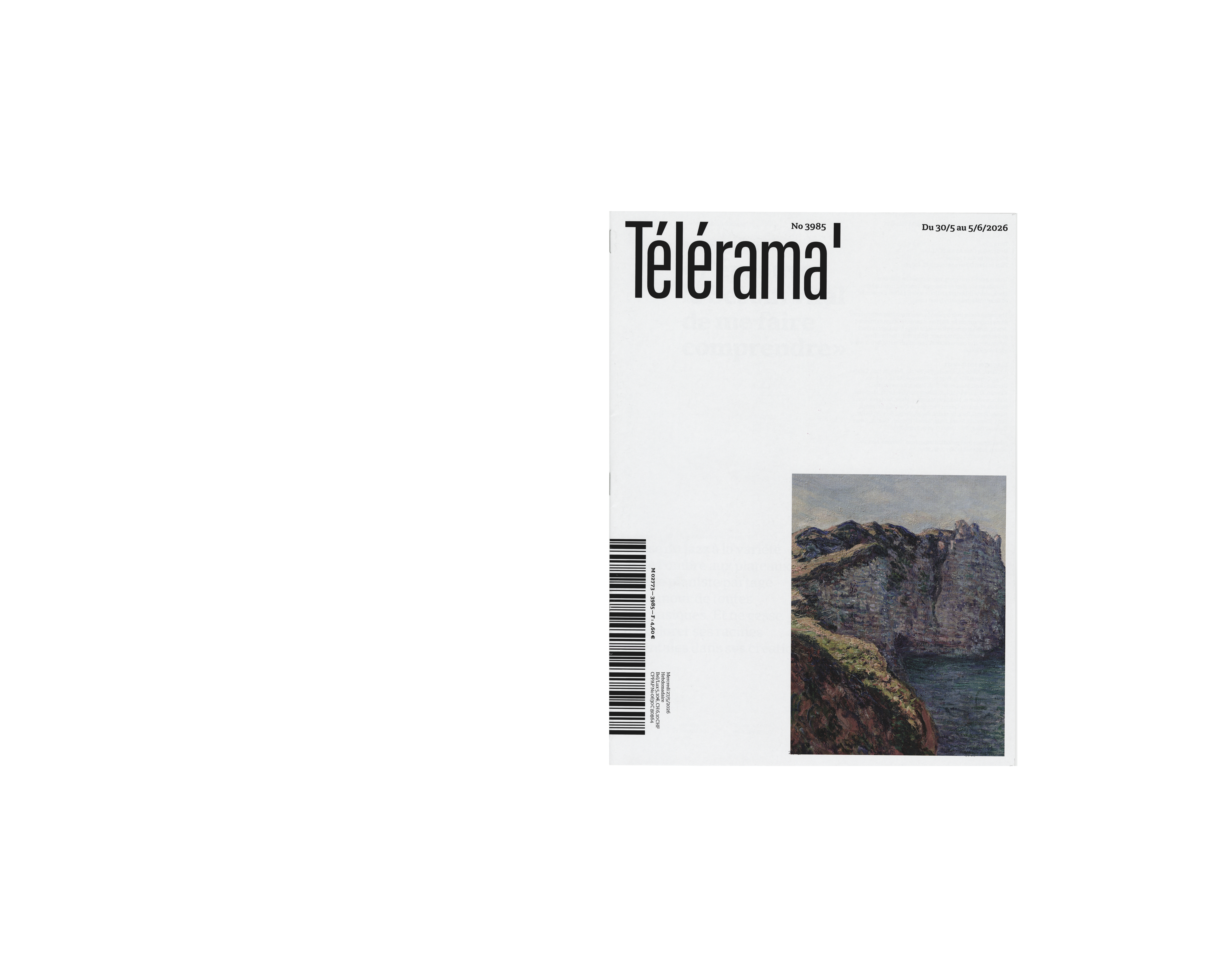
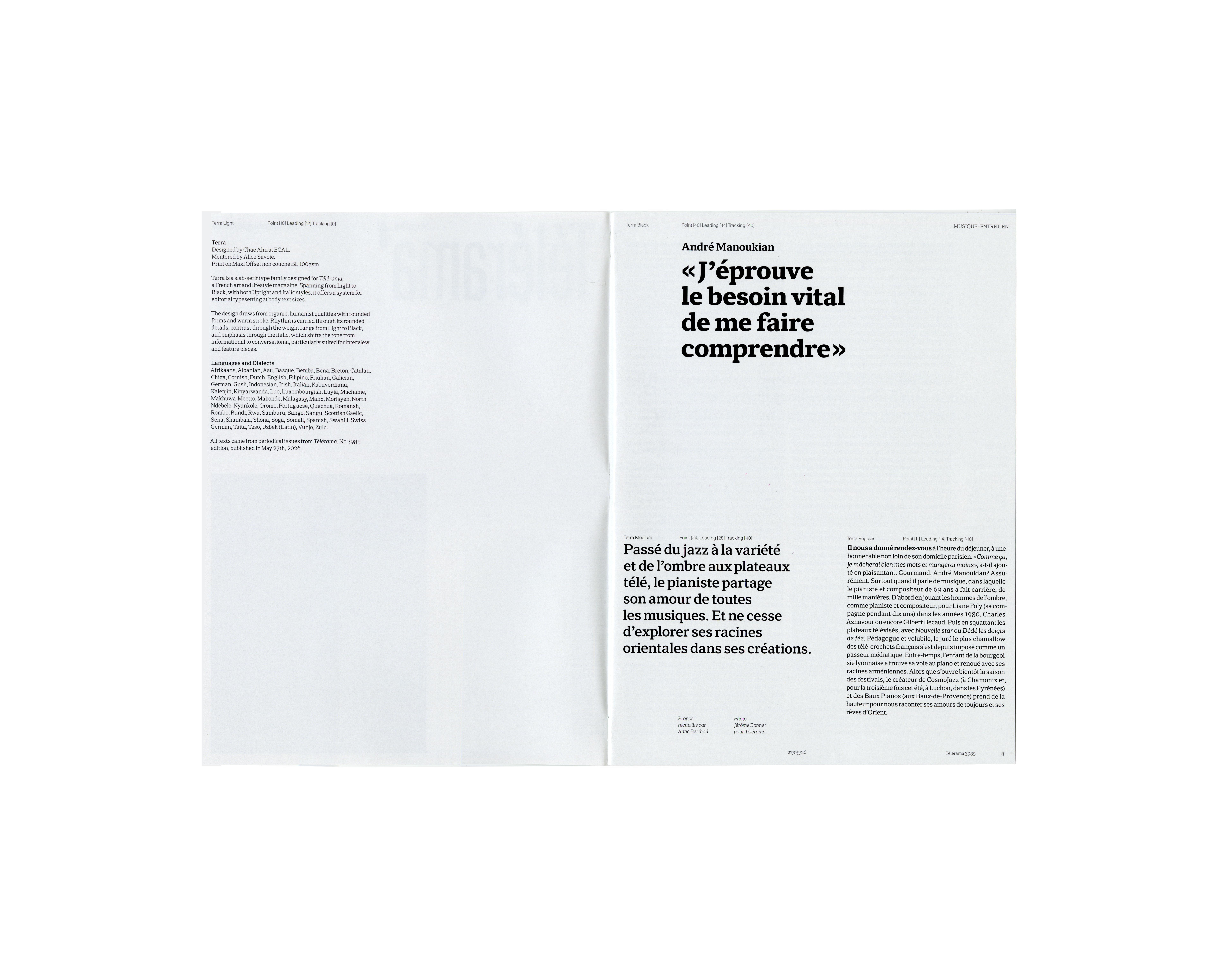
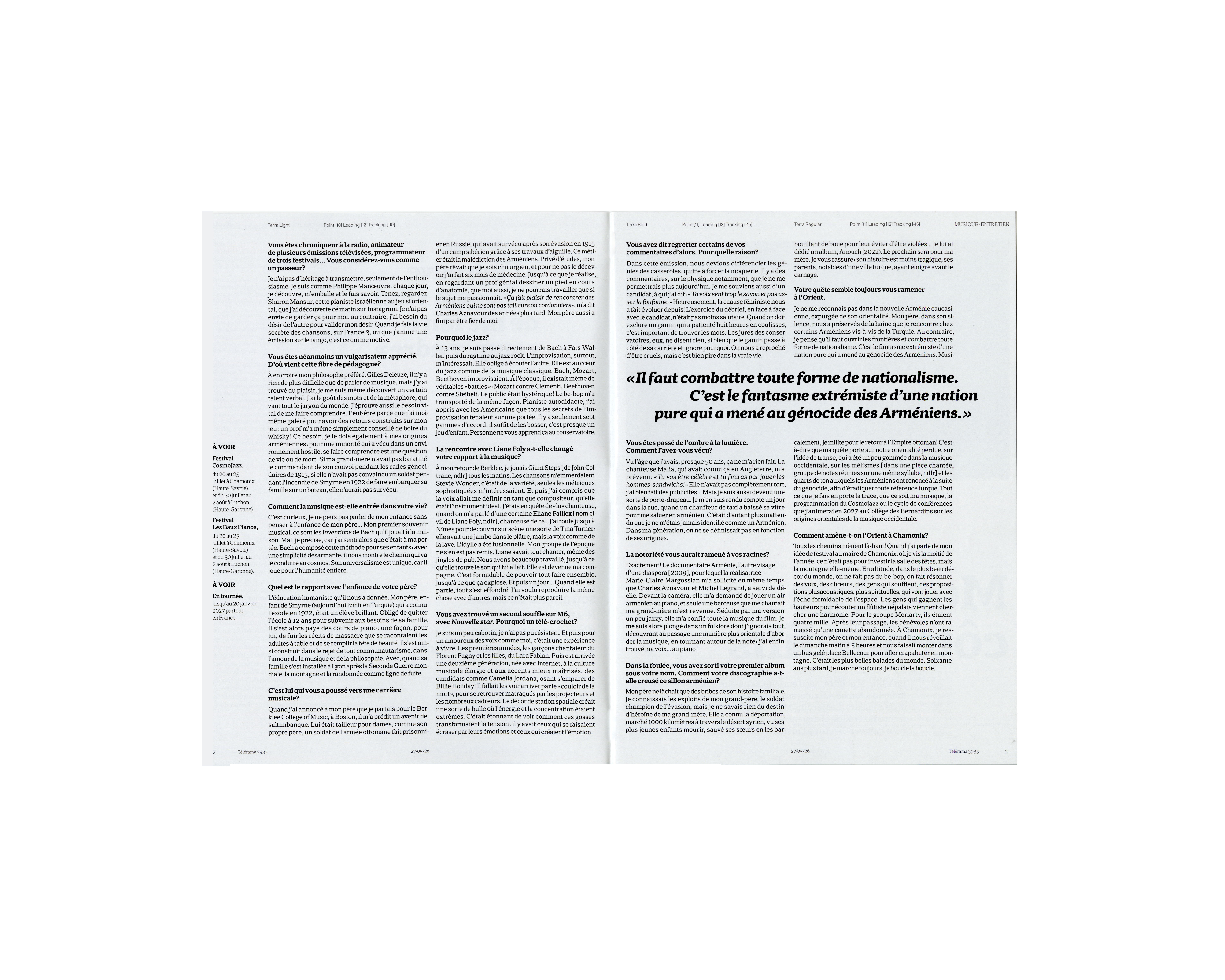
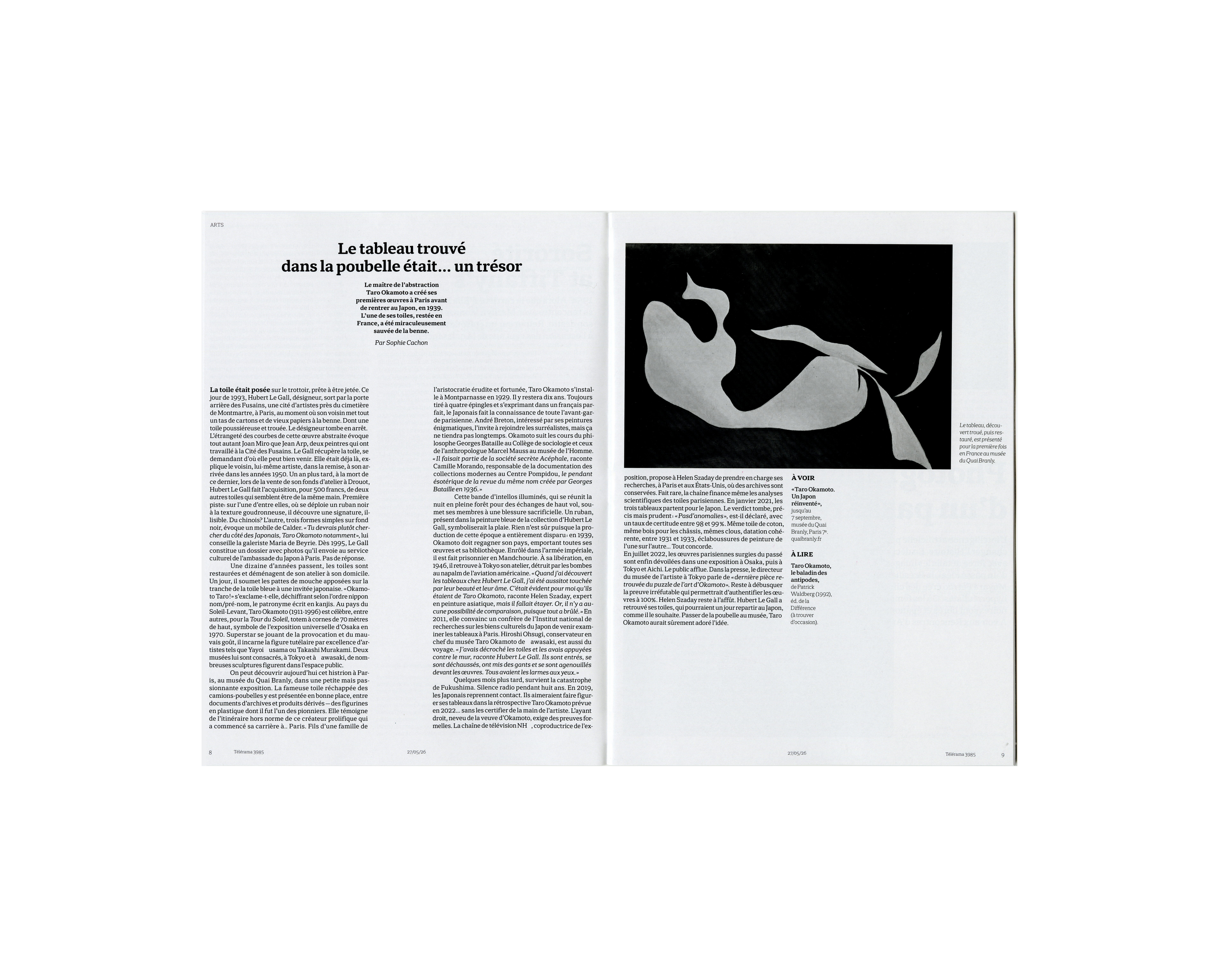
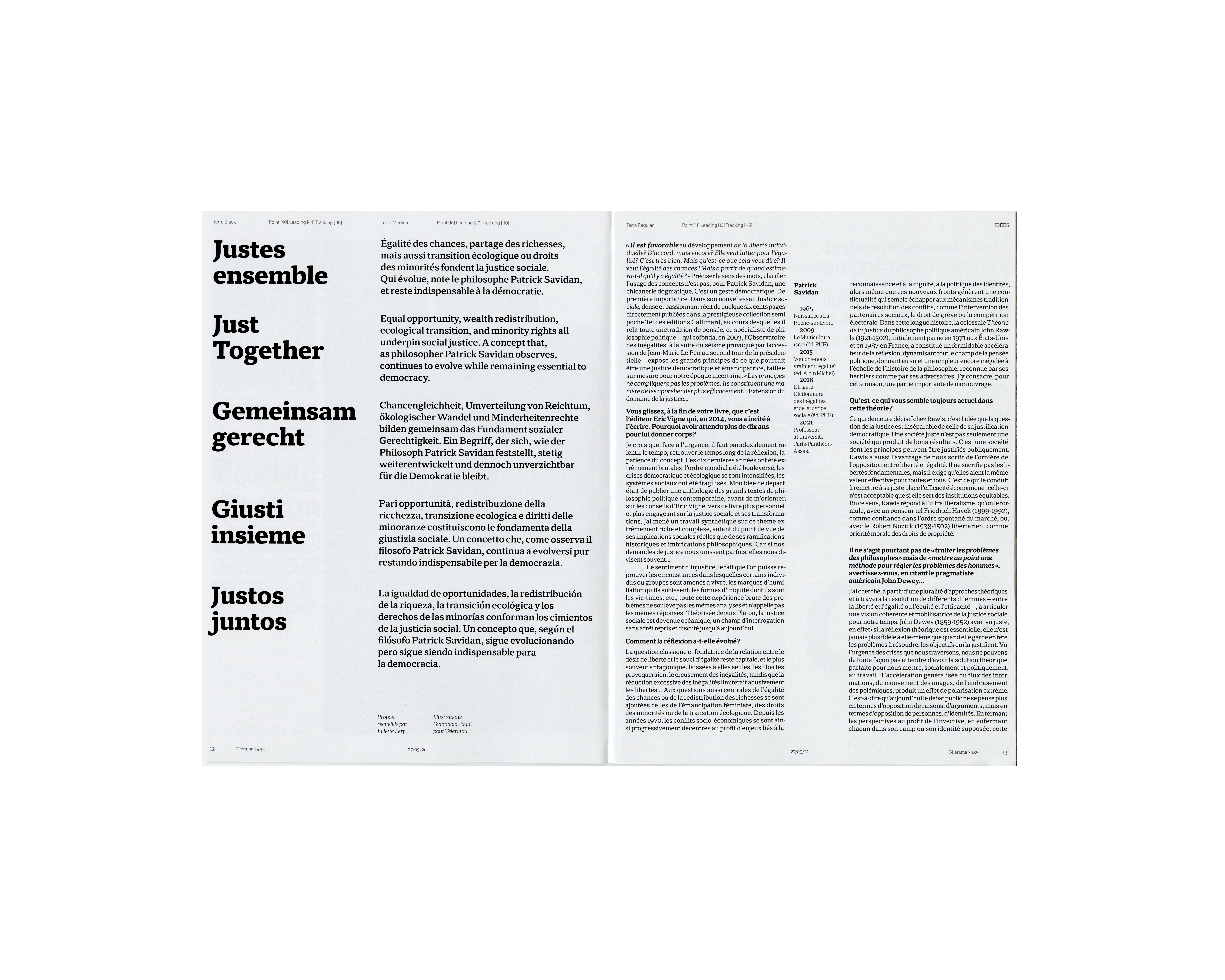
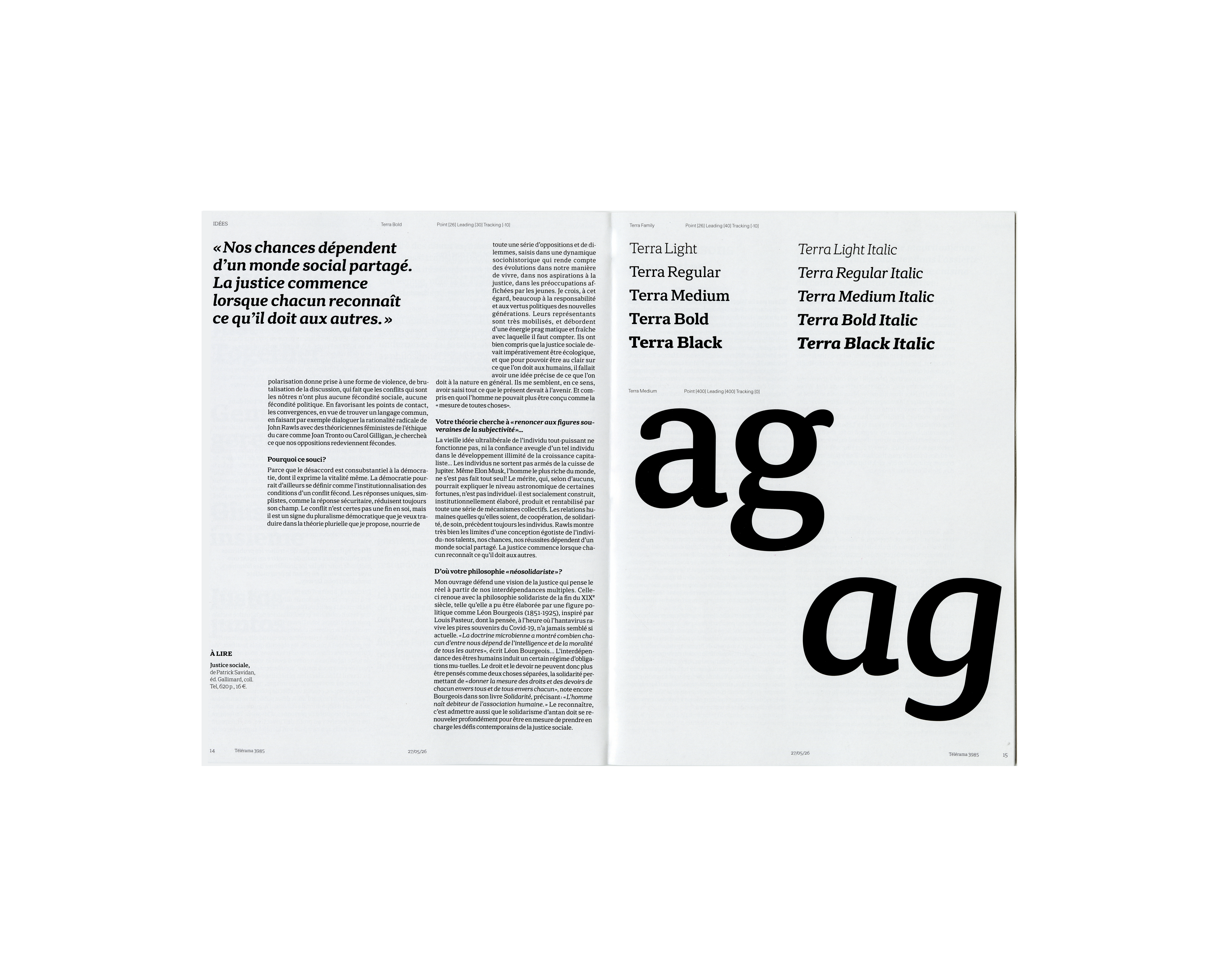
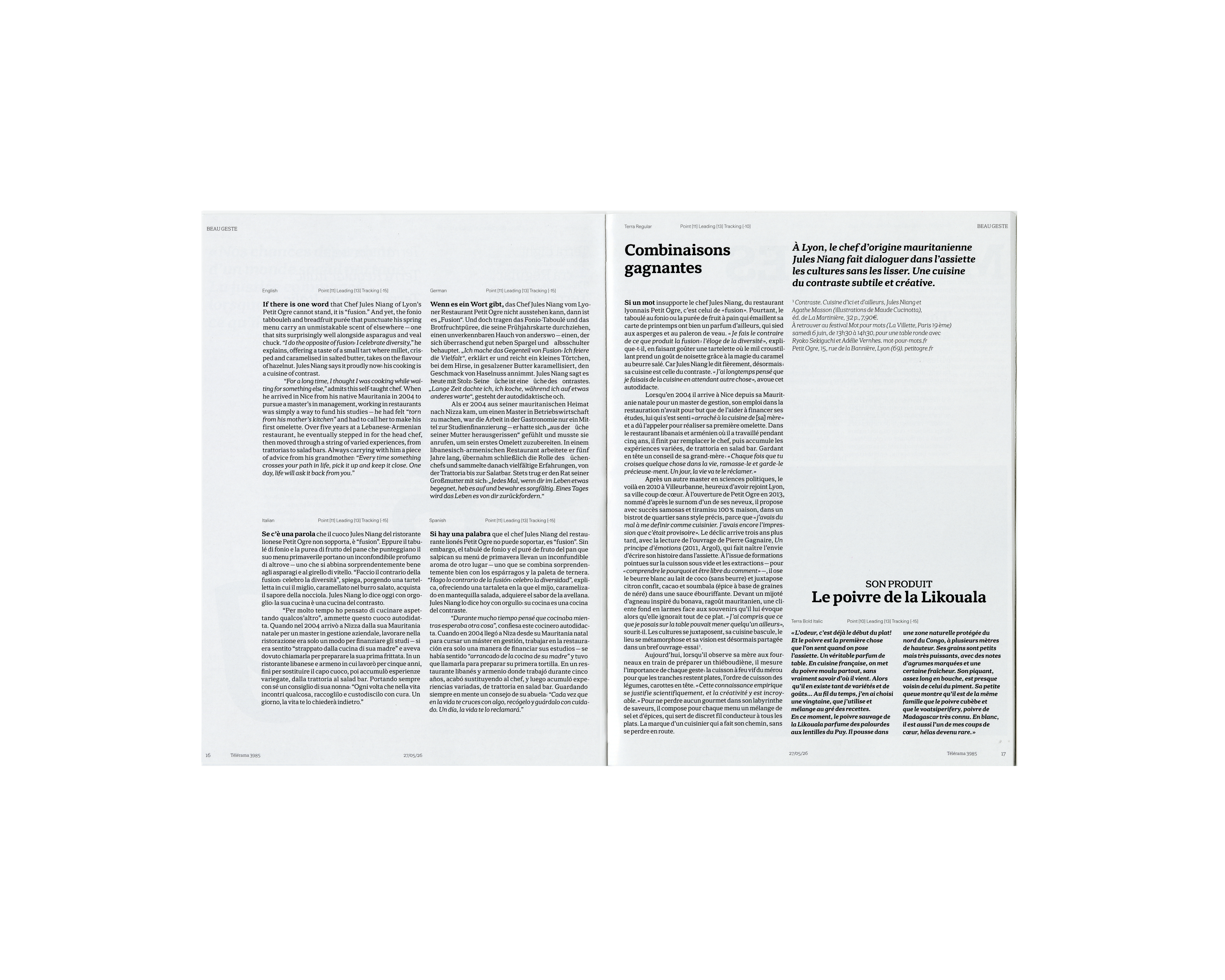
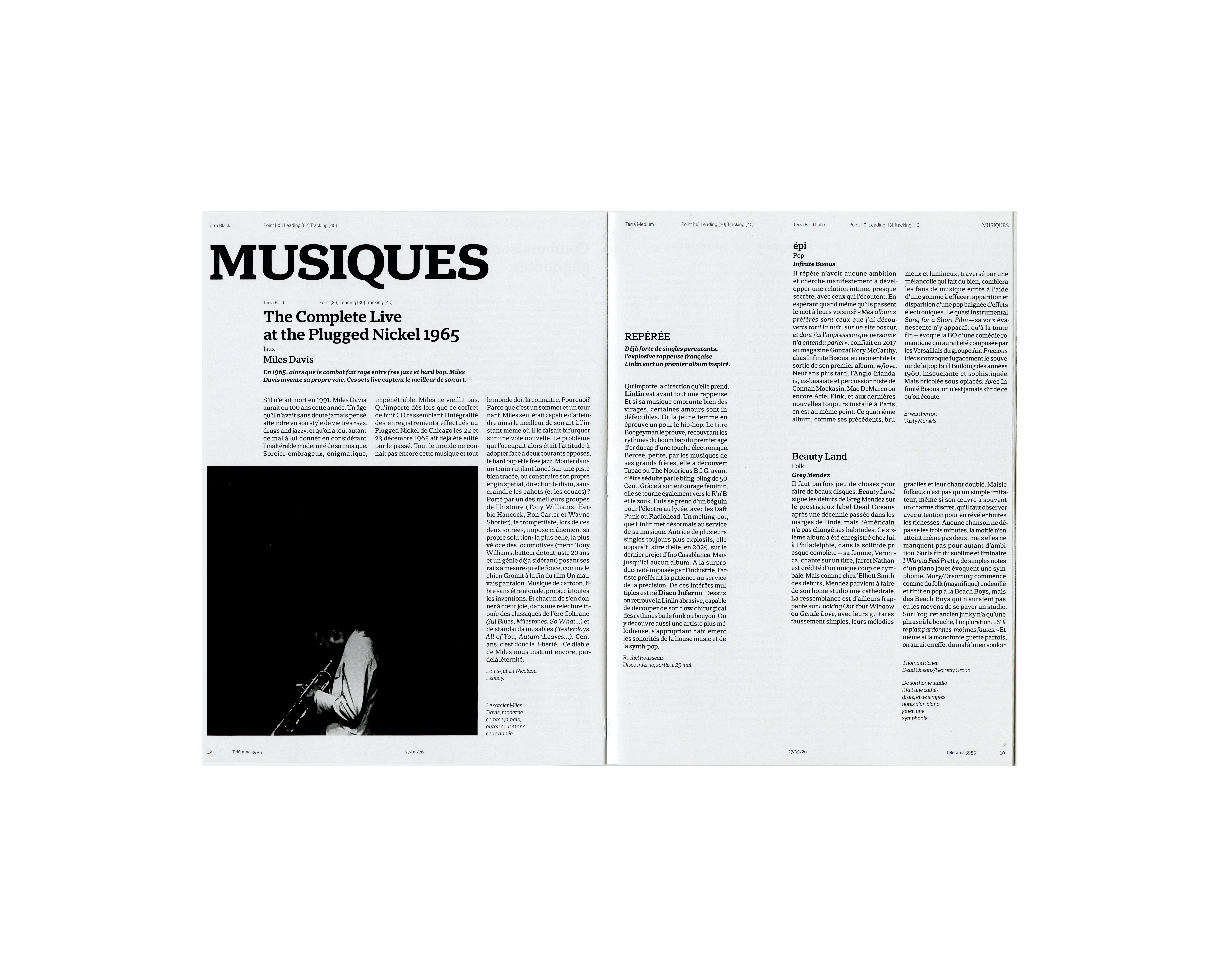
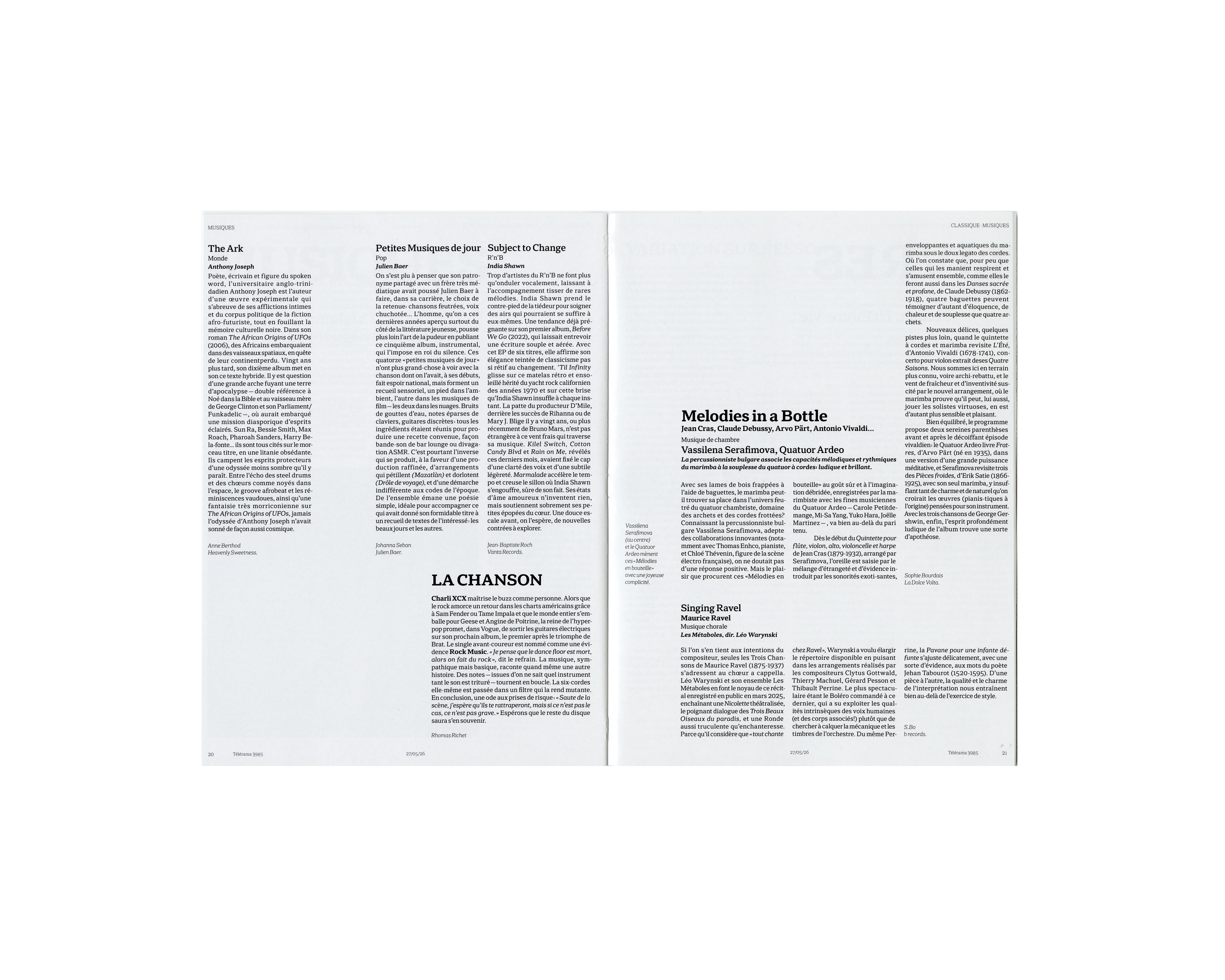
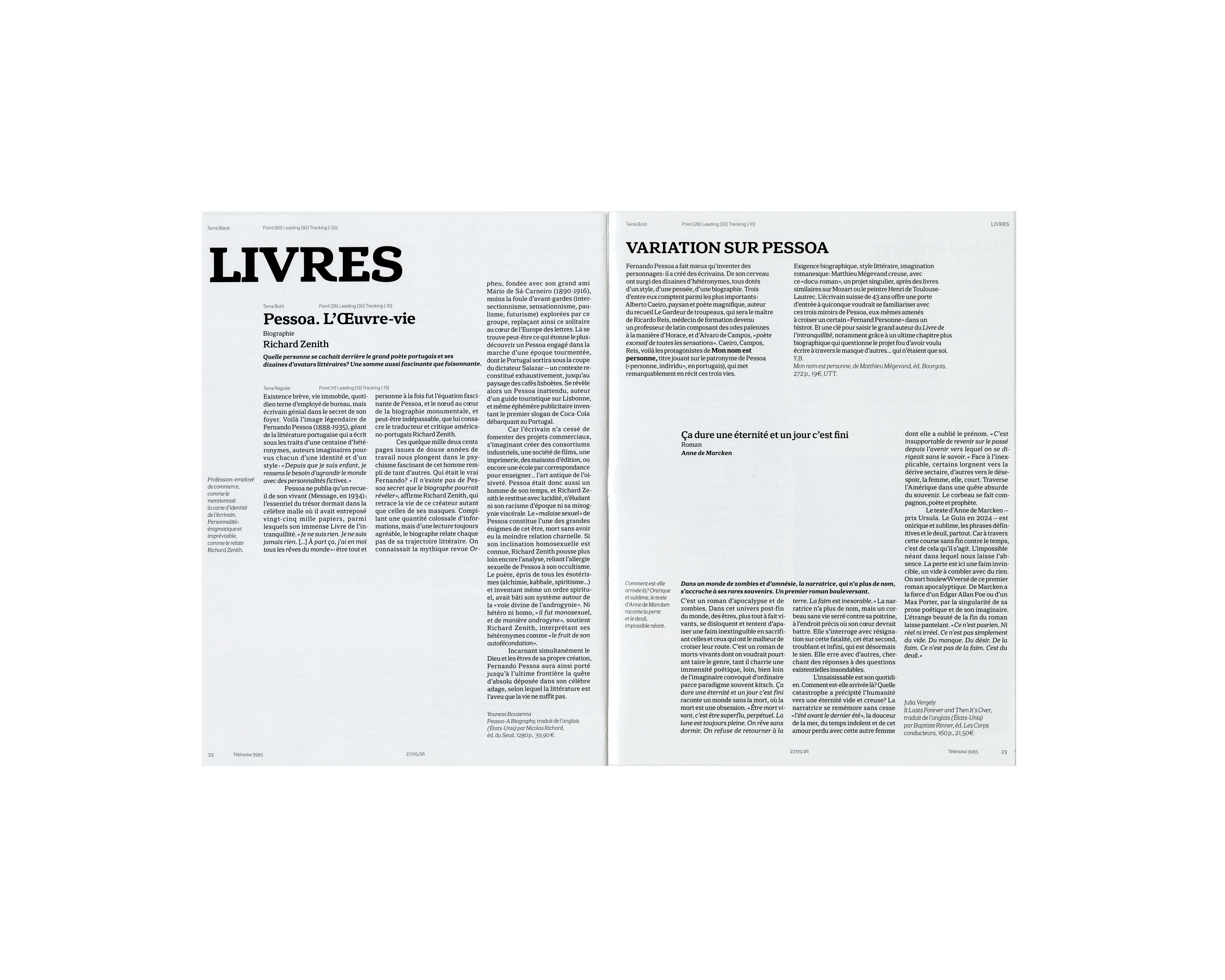
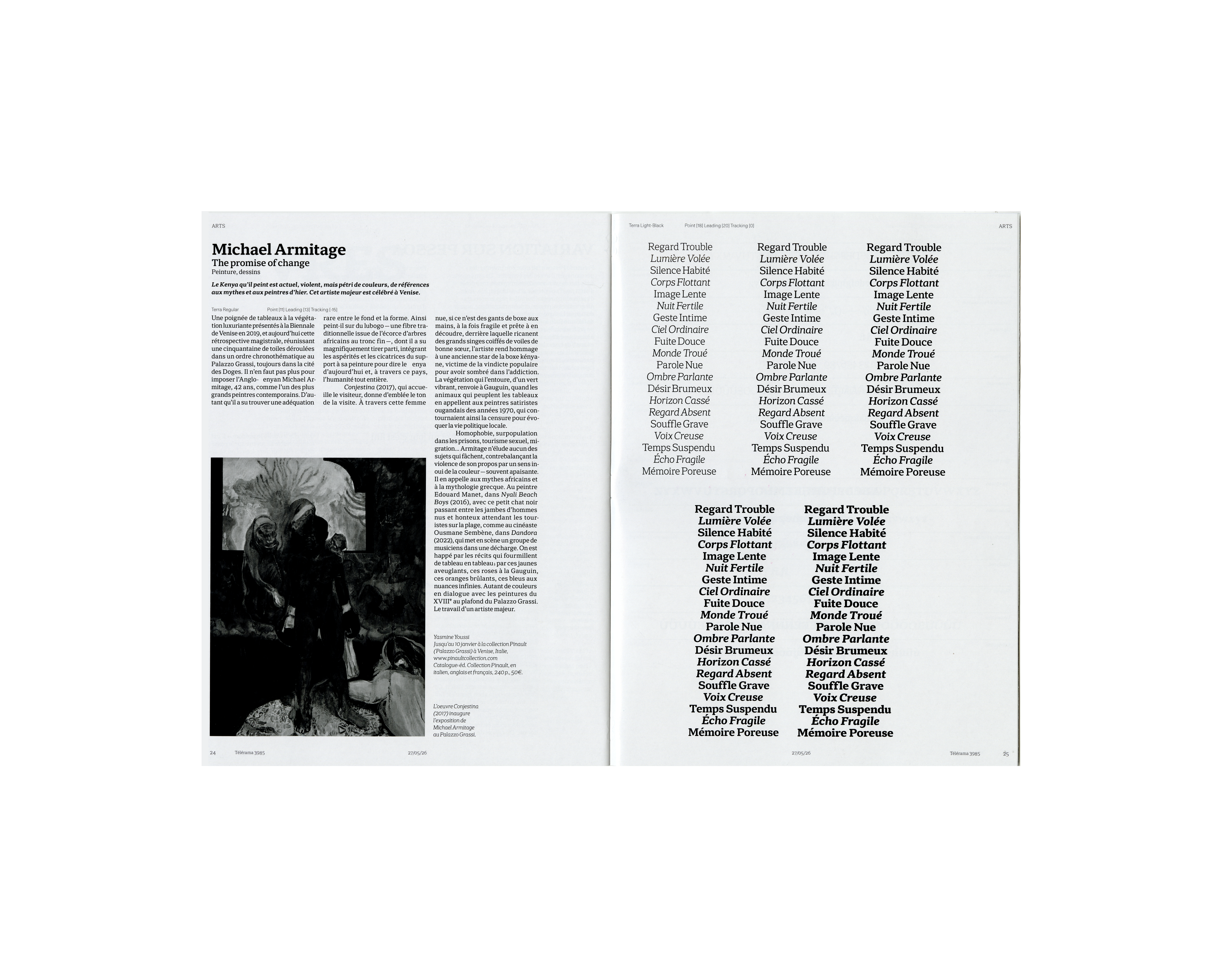
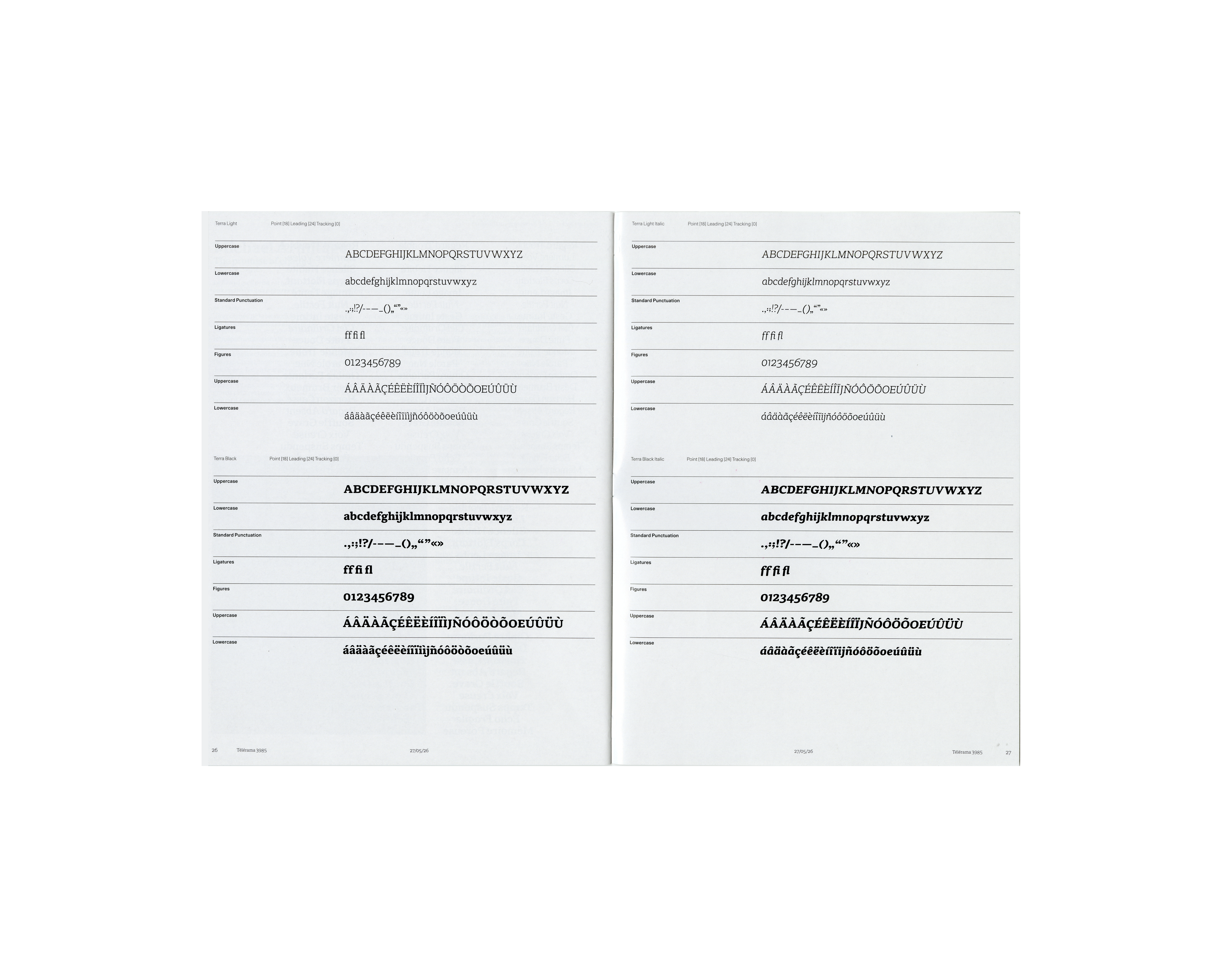
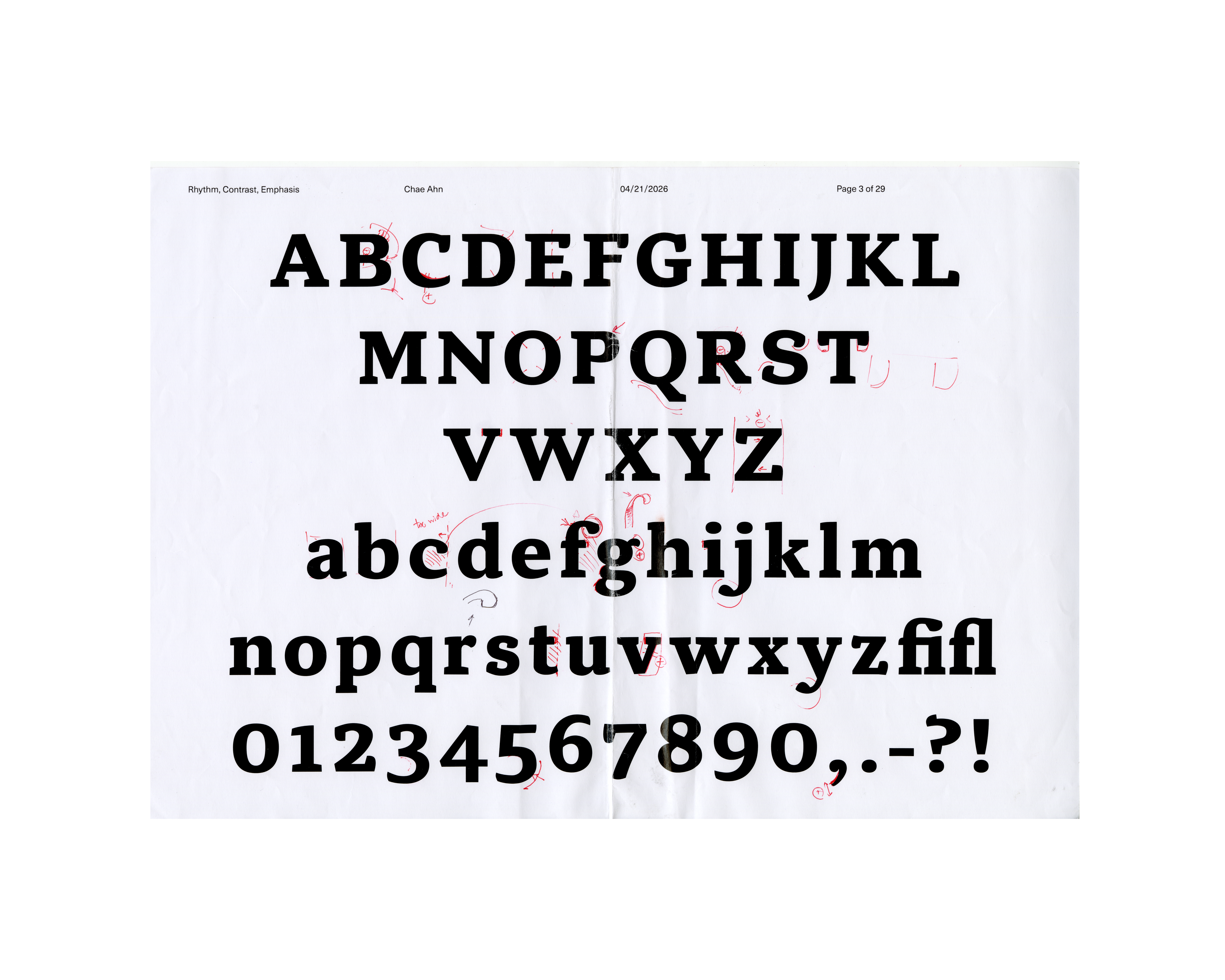
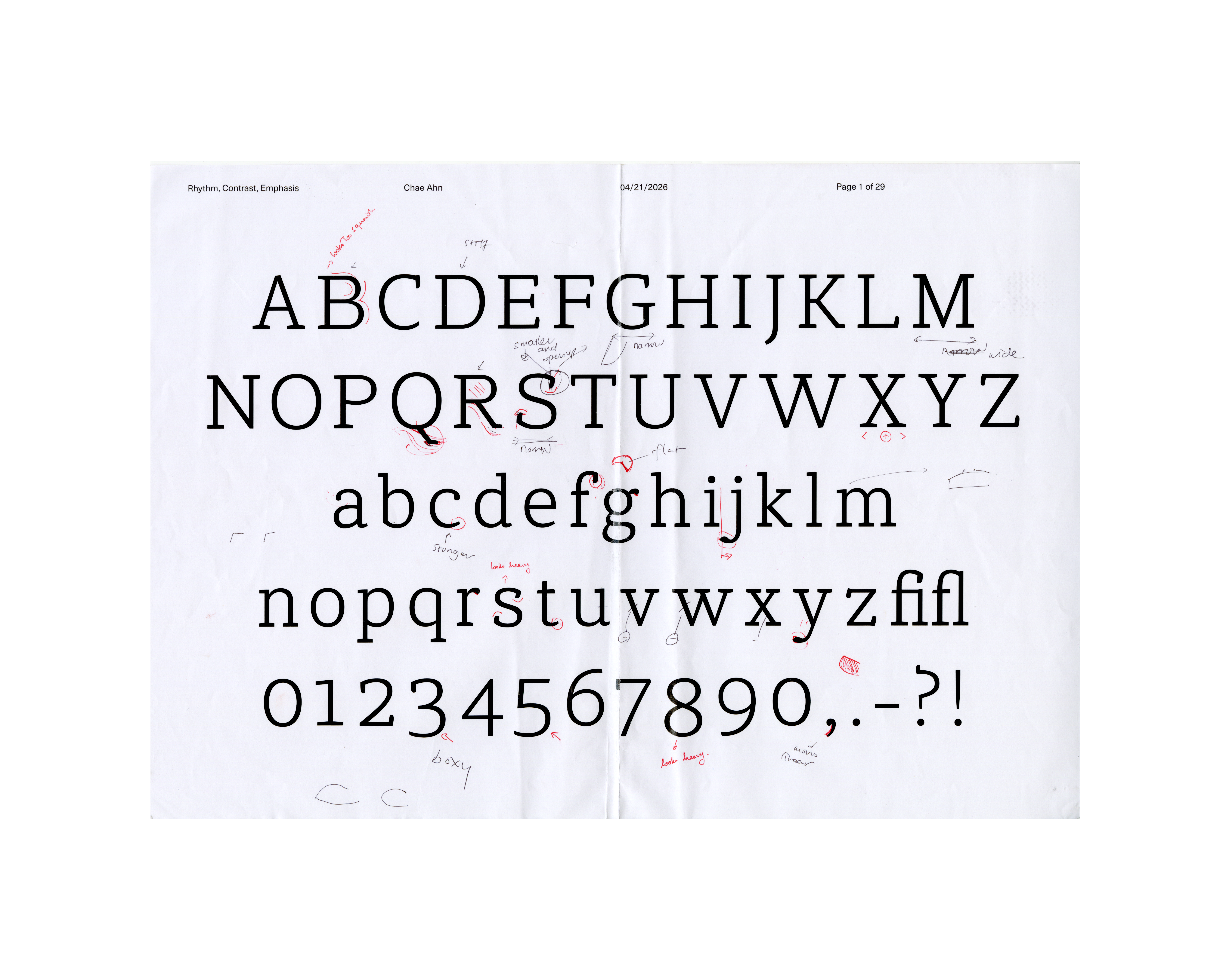
Terra is a slab-serif type family that extends this same line of thinking into contemporary type design. Designed for editorial use in an art and lifestyle magazine, Terra spans Light to Black across both Upright and Italic styles, offering a complete system for body text typesetting: rhythm carried through its rounded, humanist details, contrast built into its weight range, and emphasis delivered through an italic that shifts tone from informational to conversational, particularly suited to interview and feature pieces.