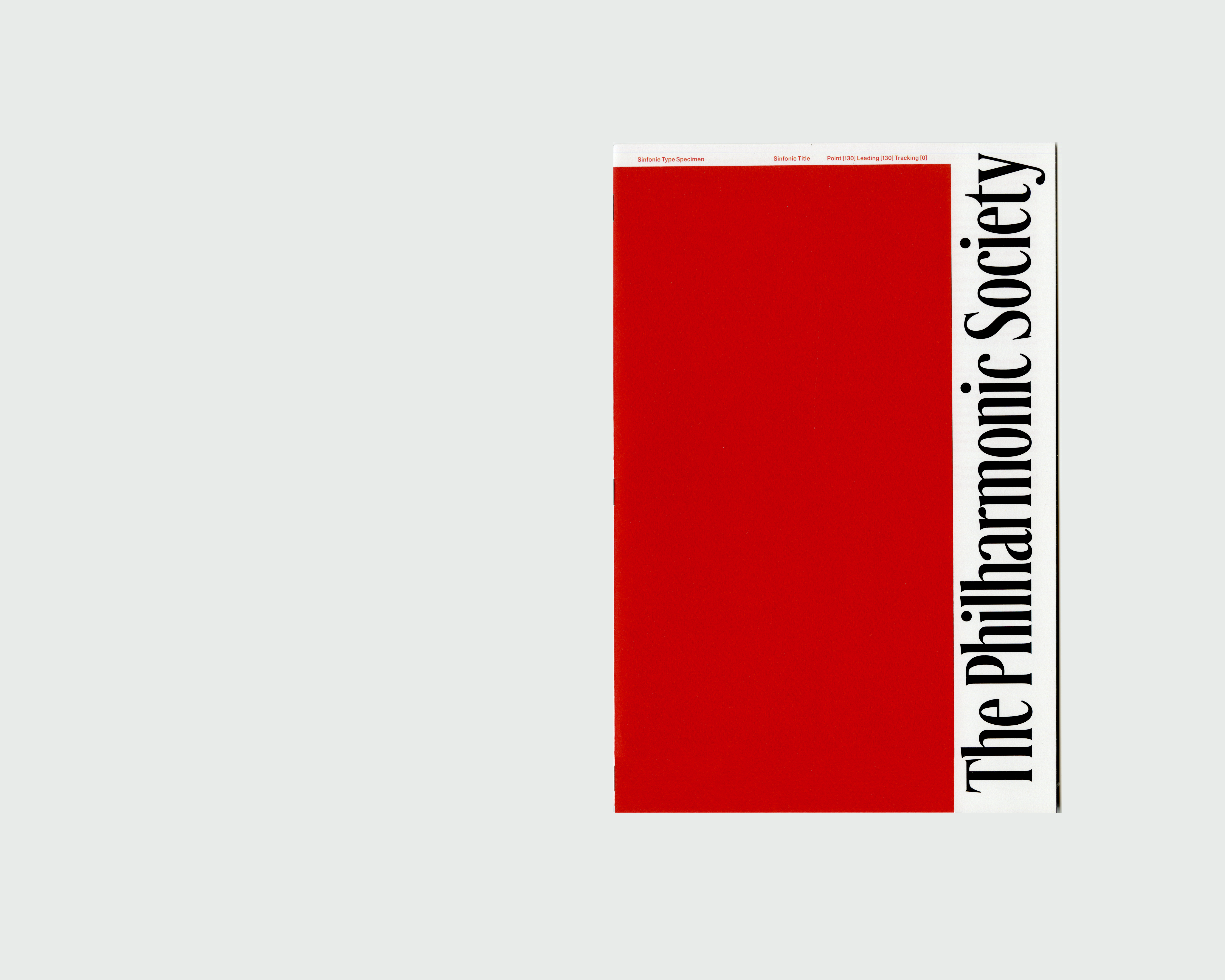
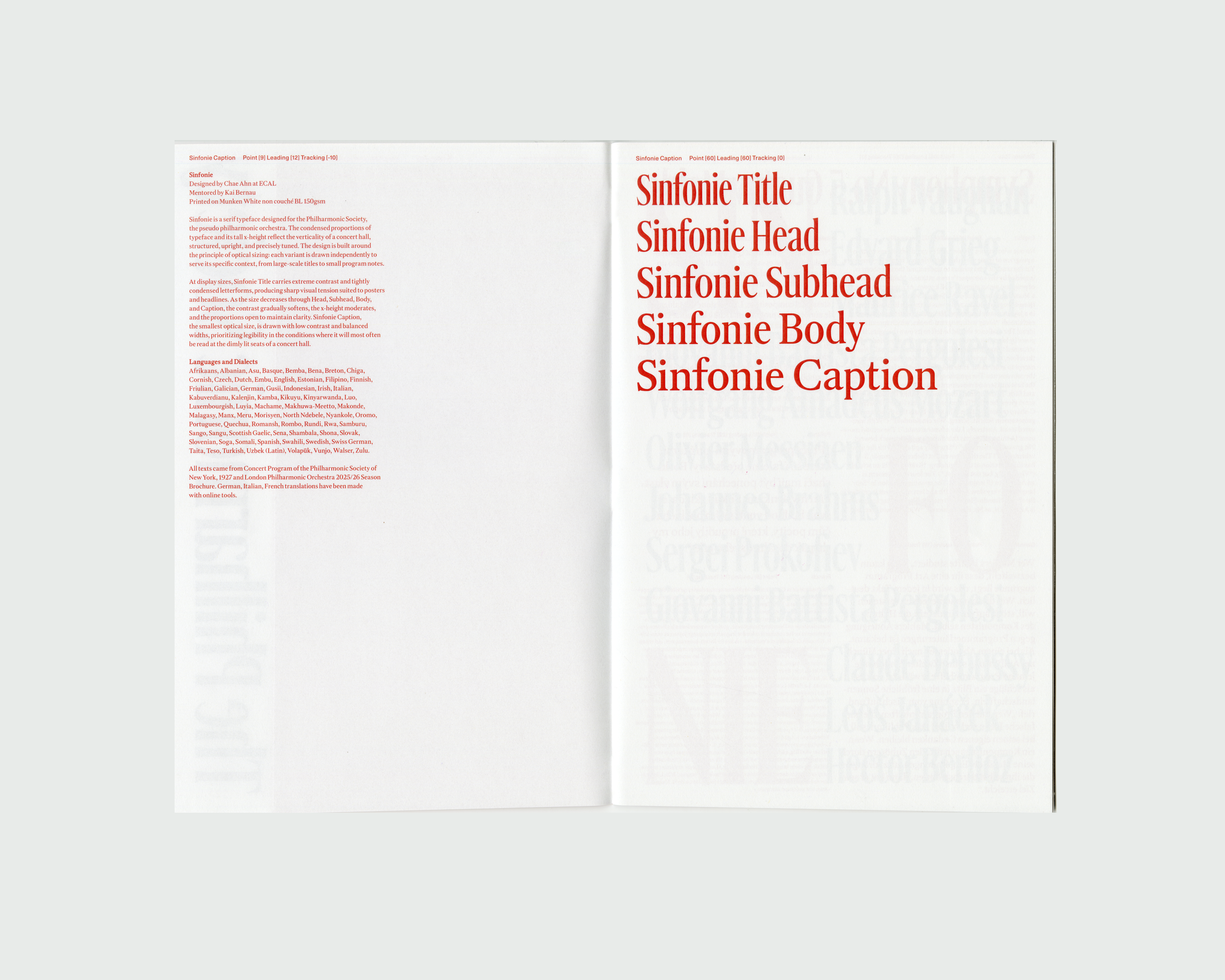
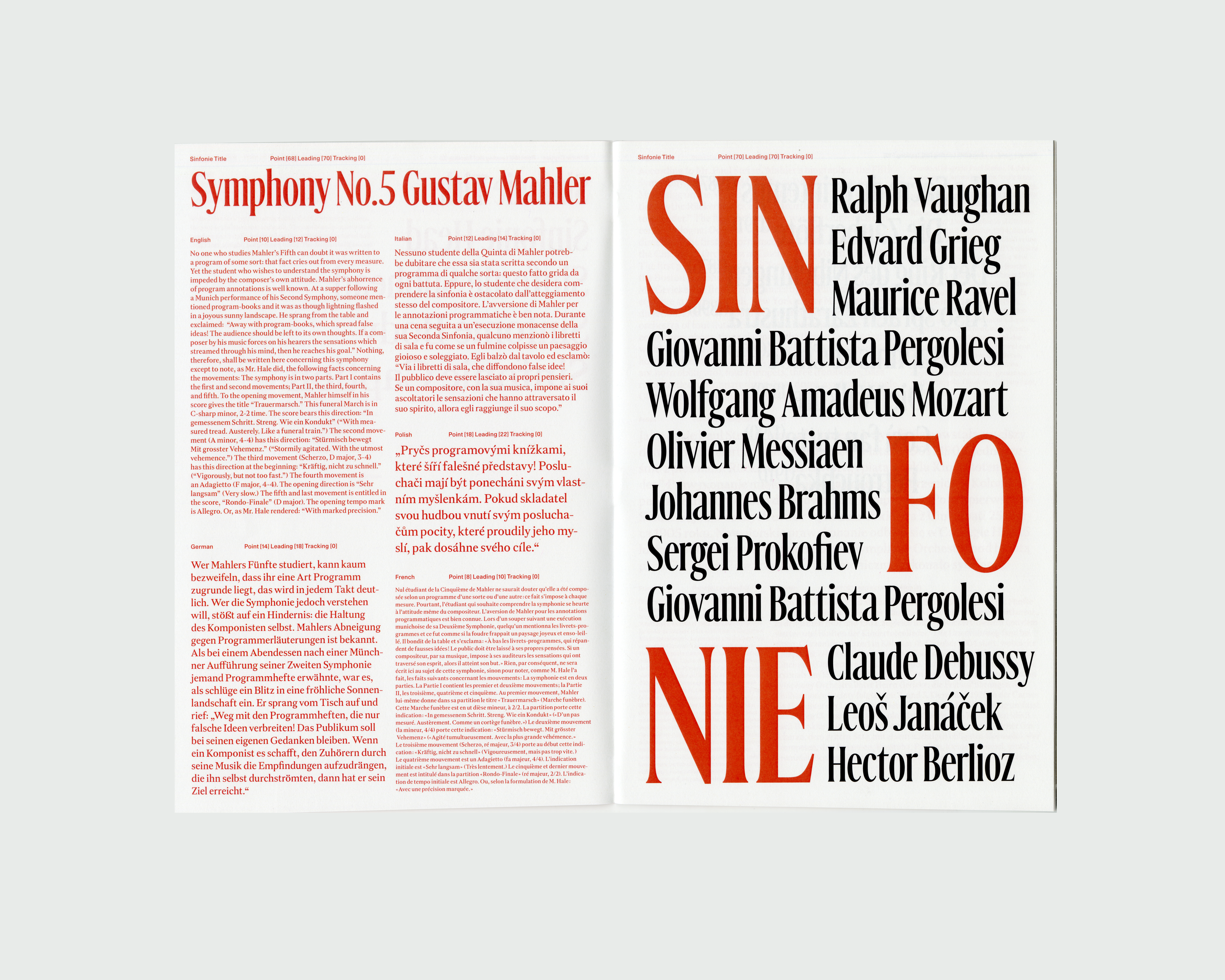
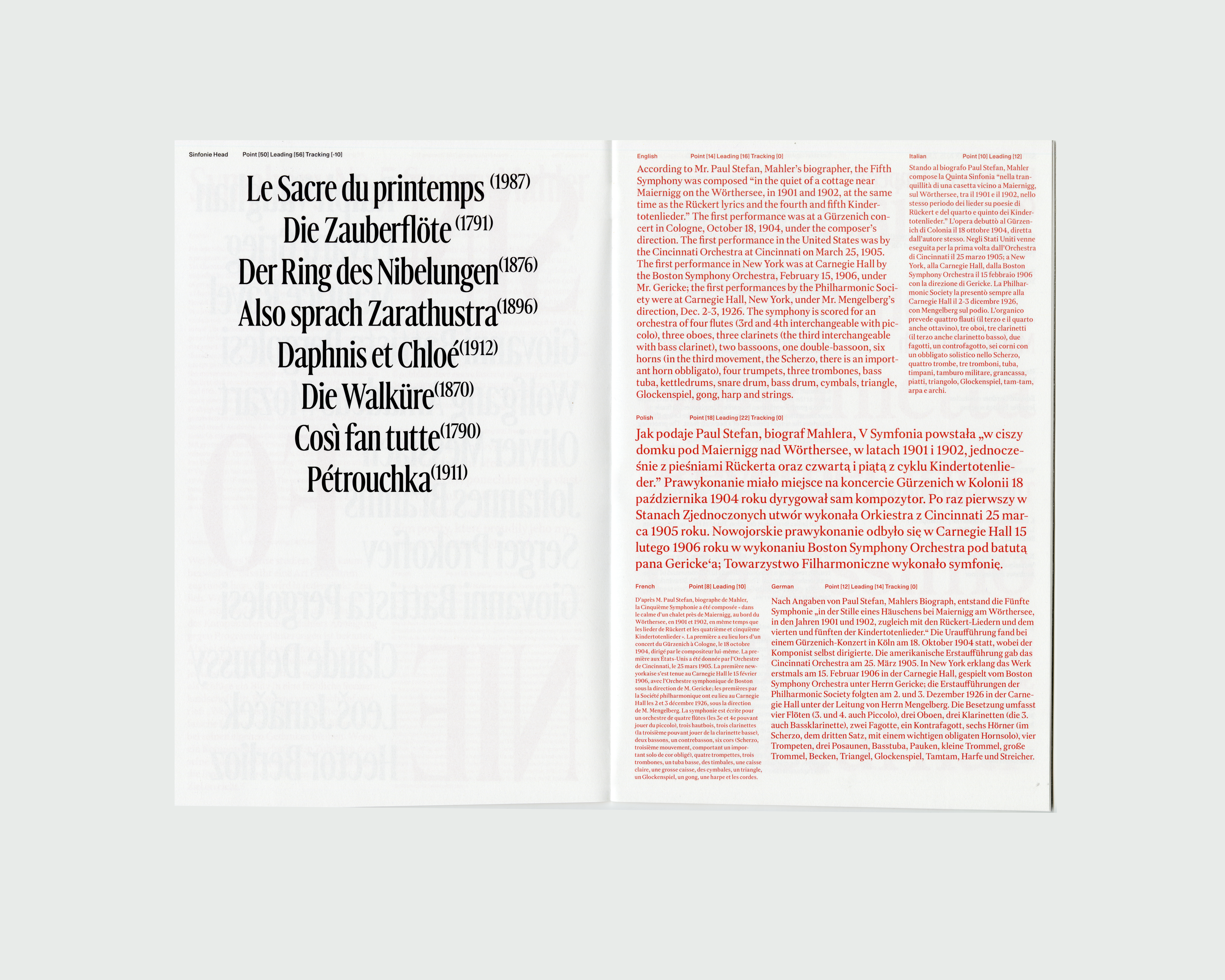
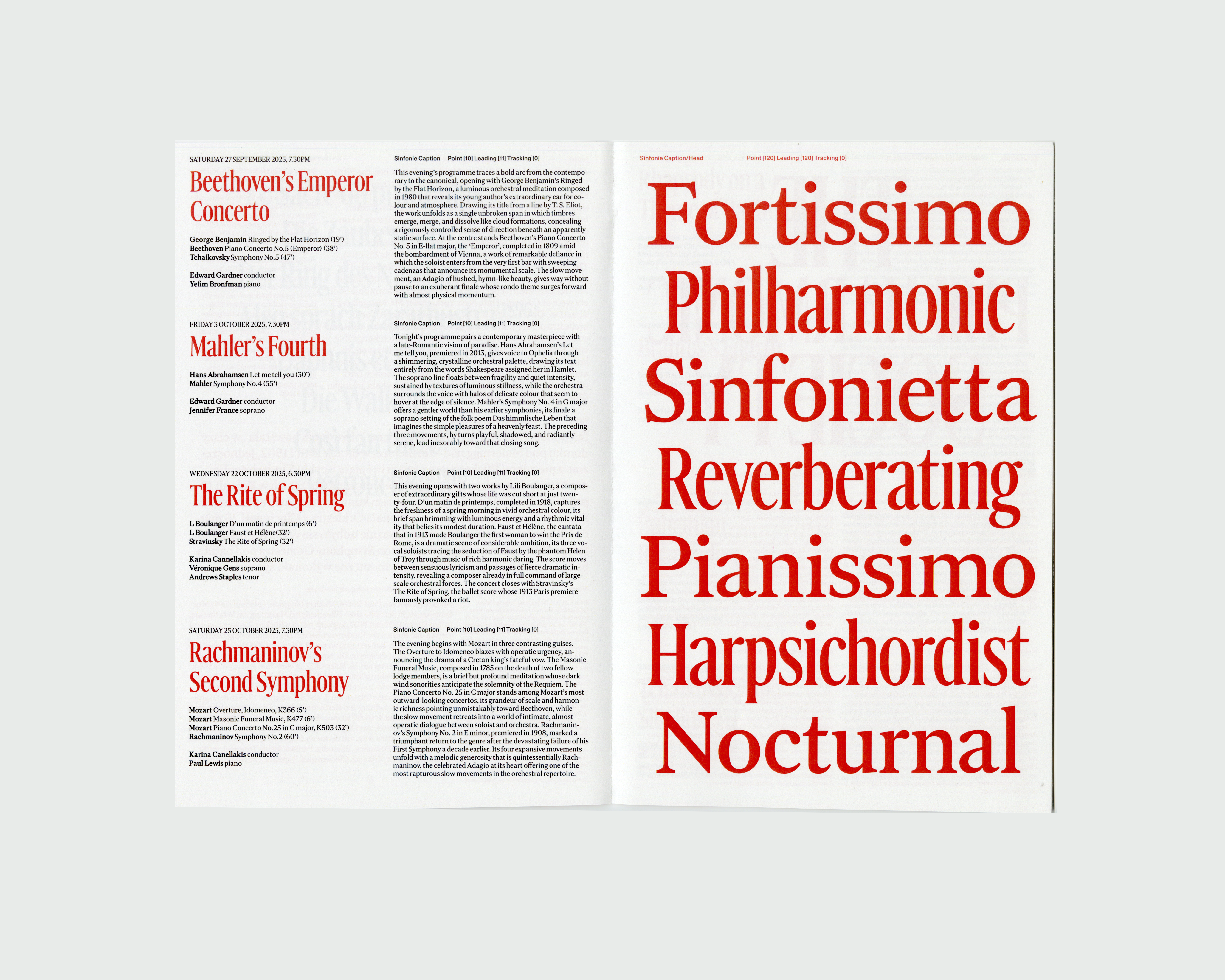
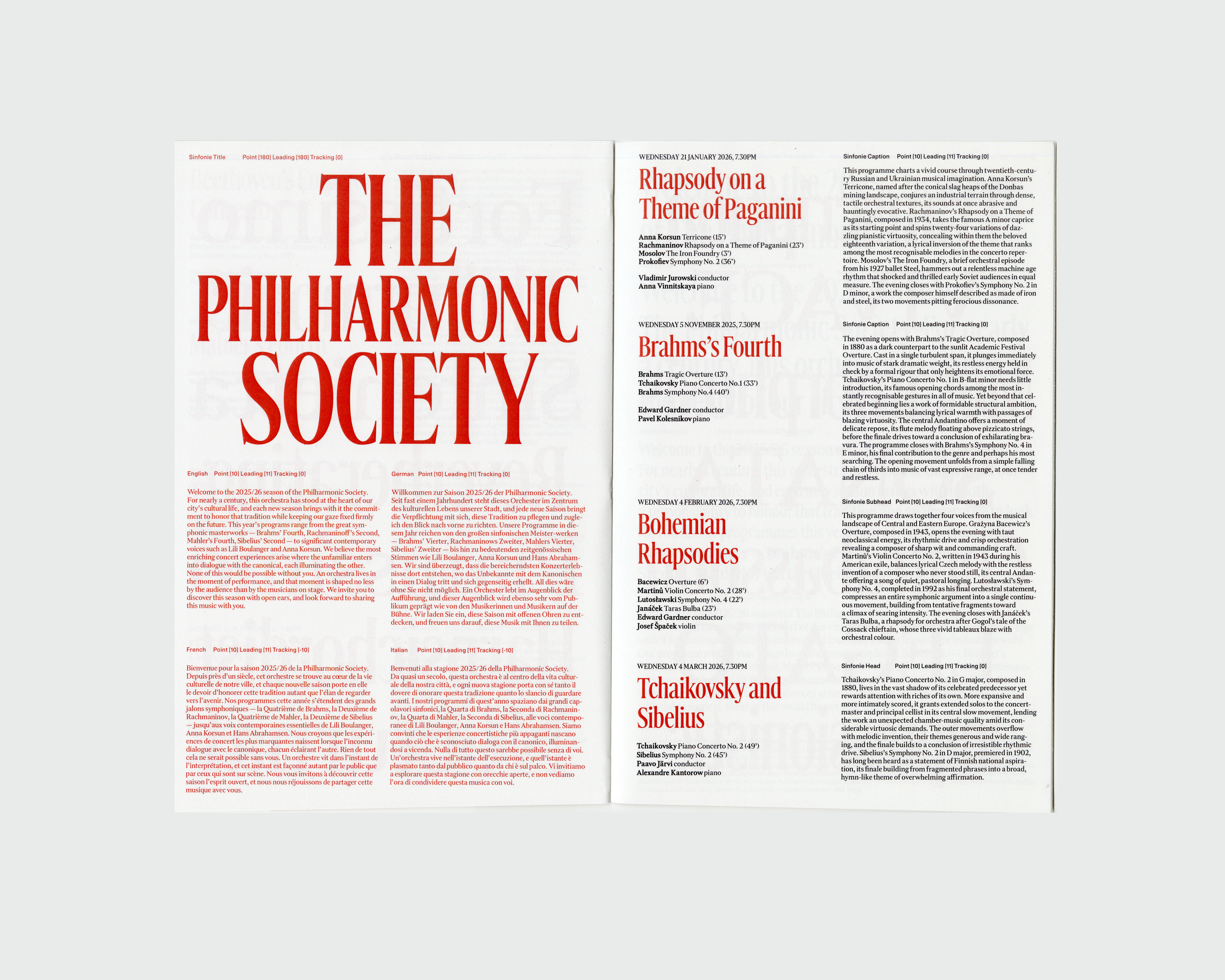
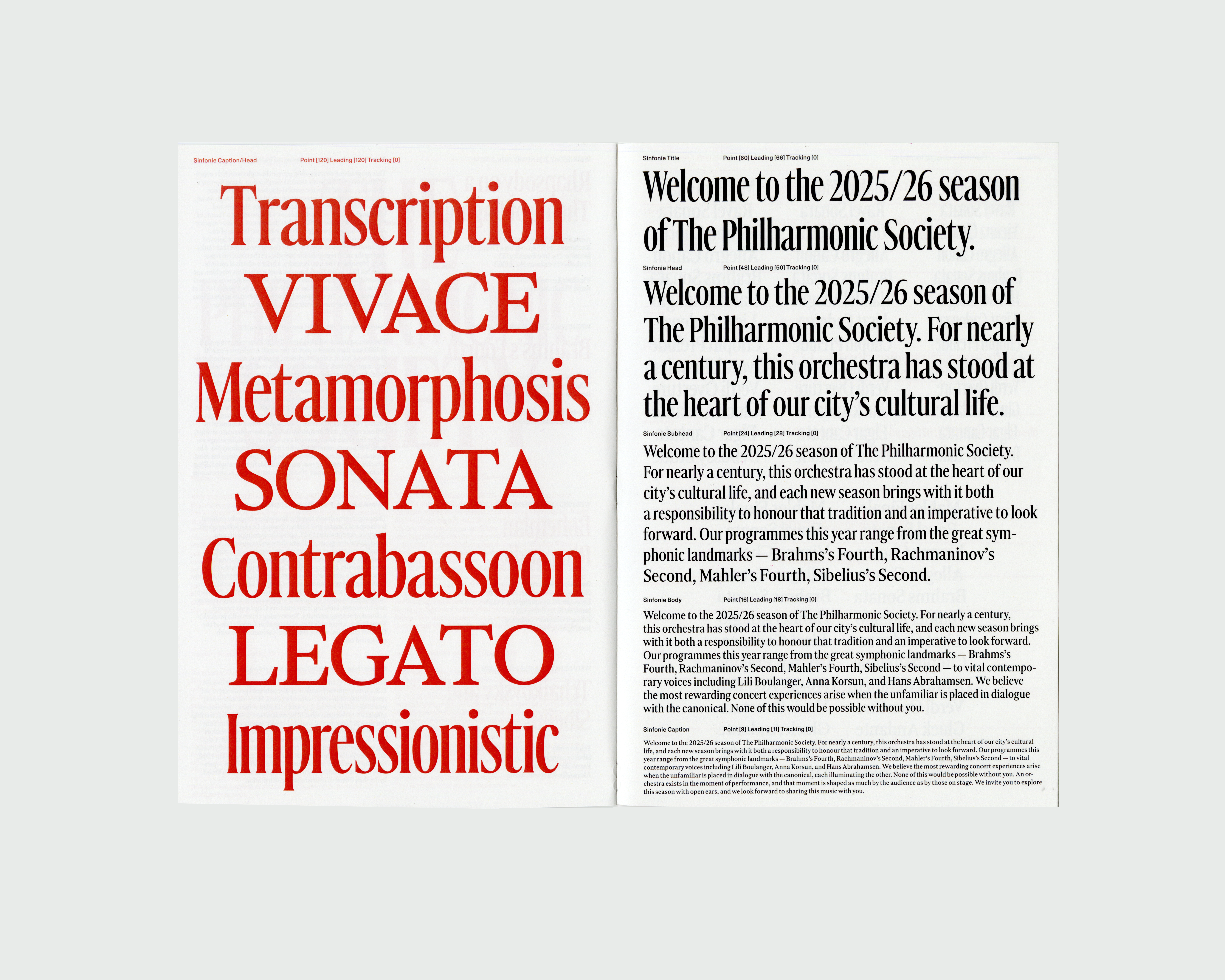
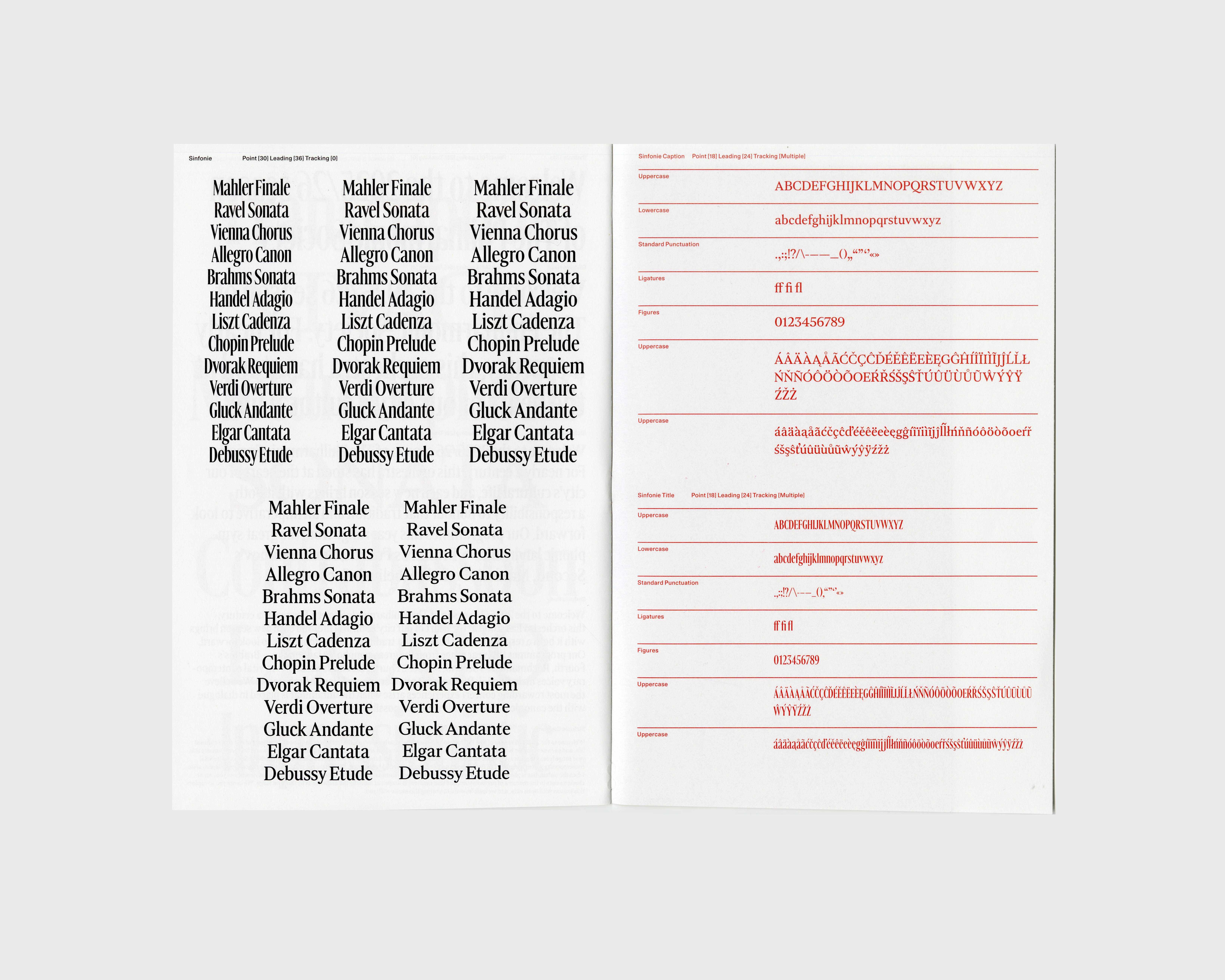
Sinfonie is a serif typeface designed for the Philharmonic Society, the pseudo philharmonic orchestra. The condensed proportions of typeface and its tall x-height reflect the verticality of a concert hall, structured, upright, and precisely tuned. The design is built around the principle of optical sizing: each variant is drawn independently to serve its specific context, from large-scale titles to small program notes.
At display sizes, Sinfonie Title carries extreme contrast and tightly condensed letterforms, producing sharp visual tension suited to posters and headlines. As the size decreases through Head, Subhead, Body, and Caption, the contrast gradually softens, the x-height moderates, and the proportions open to maintain clarity. Sinfonie Caption, the smallest optical size, is drawn with low contrast and balanced widths, prioritizing legibility in the conditions where it will most often be read at the dimly lit seats of a concert hall.